So once the music end of things was done on the new album, i had to figure out how i would package the physical version of it. i wanted to do something a little different, so i opted for a packaging option from Stumptown Printers in Portland, Oregon made from recycled paper rather than the typical boring jewel case. It's actually designed to be the same size as a typical plastic DVD case and my thought was that it would be great to use it in a landscape orientation, as i hadn't seen a lot of releases done up that way before.
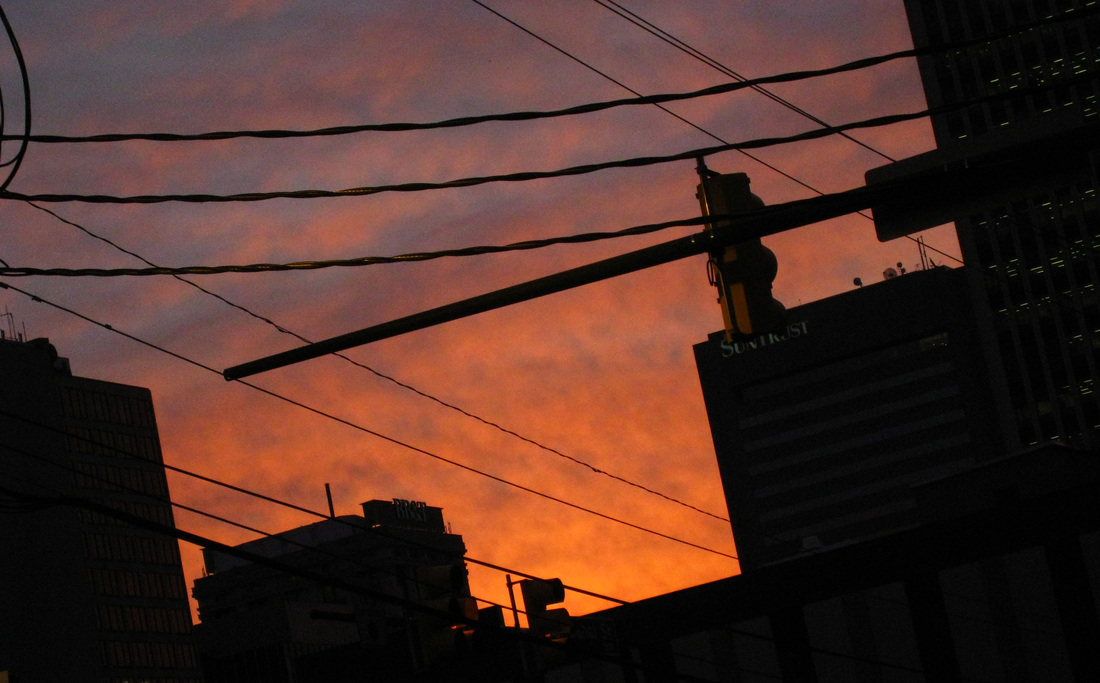
I've always dabbled in the visual art world, but with everything else i do, i just don't have a lot of time for it, so i really wanted to take advantage of this album release as a chance to do something special. and it all started with a photo i took when leaving the studio as the sun was rising after a crazy all night recording session:
I've always dabbled in the visual art world, but with everything else i do, i just don't have a lot of time for it, so i really wanted to take advantage of this album release as a chance to do something special. and it all started with a photo i took when leaving the studio as the sun was rising after a crazy all night recording session:
This Image really just captured the feeling of everything i was working when i started the sessions at the top of 2009 that would eventually lead to the release of this album. i had just gone through a breakup a couple months before, i was working long hours, and was a bit disenchanted with life at the time. and i basically just realized that i wasn't doing enough with music, which has always been my biggest passion and the only things i've every really been able to count on. it was time to get things back on track. so sleep be damned, even after long days at work i ended up staying up and playing and writing and recording sporadically through the rest of 2009 and 2010, and then after composing music for Octavo, i had finally accumulated enough music i felt strongly enough about to release an album. The music on the album was pretty much always born out of the small hours, and i became sort of obsessed with feeling like i was the only person awake in my little corner of downtown Richmond. So many times i'd leave the studio as the sun was coming up, as construction workers began parking on the 4th street bridge, there was a certain romanticism to it. That spurred both the title of the album and the cover artwork.
So with the concept in mind and knowing what packaging i was going to use, i was off to figure out how i could print it, and i really wanted to figure out a way to get this thing screen printed. Initially i though about doing two different halftone gradients to achieve the sunrise effect which would be cool, but when i sat down with my friends at Triple Stamp Press to talk about it, my buddy Wil had a number of other ideas about how to pull it off. We ended up deciding to go with a split fountain technique thanks to Wil, and it turned out amazing! The coolest thing about this technique is that you are pulling two colors of ink across the screen at once, which allows the colors to mix, and consequently every single print ends up being slightly different because of it. with me doing a run of 300, this makes things really special, everyone who gets a physical package will end up with a one of a kind art piece as well. below you'll see a slideshow of some of the more interesting covers that turned out during the printing process:
So with the concept in mind and knowing what packaging i was going to use, i was off to figure out how i could print it, and i really wanted to figure out a way to get this thing screen printed. Initially i though about doing two different halftone gradients to achieve the sunrise effect which would be cool, but when i sat down with my friends at Triple Stamp Press to talk about it, my buddy Wil had a number of other ideas about how to pull it off. We ended up deciding to go with a split fountain technique thanks to Wil, and it turned out amazing! The coolest thing about this technique is that you are pulling two colors of ink across the screen at once, which allows the colors to mix, and consequently every single print ends up being slightly different because of it. with me doing a run of 300, this makes things really special, everyone who gets a physical package will end up with a one of a kind art piece as well. below you'll see a slideshow of some of the more interesting covers that turned out during the printing process:
Now on both the cd and the insert in the package i ended up doing my own take on the design aesthetic from the United Artists Ultra Audio Series of records. I first ran across these records in high school, i had always loved the style and wanted to do a bit of a tribute to them. here's some various shots of the rest of the packaging from the assembly process:
I'm really happy with how this whole thing turned out, i wanted to create something that i felt as strongly about as i do with the music, and i really think this does it justice. Massive thanks again to Triple Stamp for the screen printing work, and also to Revolve for printing and duplicating the CD'S!


 RSS Feed